


Mauldin Unveils New City Brand: A Fusion of Stability and Innovation
April 12, 2026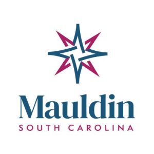
The City of Mauldin is stepping into a new era of identity with the official launch of a modernized city logo and branding strategy. The new visual identity, unveiled this week, is designed to reflect a community that is both firmly rooted in its history and aggressively forward-thinking.
The centerpiece of the rebrand is a geometric, star-like emblem featuring interlocking lines in a bold two-color palette: blue and magenta-red.
The Psychology of the Palette
City officials shared a detailed breakdown of the symbolism behind the new aesthetic, noting that the choice of colors was deeply intentional to represent the dual nature of Mauldin’s current growth:
-
Blue for Stability: The primary blue signifies trust, dependability, and calmness. It represents the city’s established foundations and the reliable quality of life that has long drawn residents to the area.
-
Magenta-Red for Innovation: The vibrant magenta-red serves as a symbol of passion, creativity, and unconventionality. It is intended to draw attention and spark imagination, reflecting Mauldin’s recent evolution into a hub for new development and creative business.
“Together, these colors blend stability with energy,” the city shared in a statement. “They convey that we are firmly rooted but also forward-thinking, creative, and constantly evolving.”
A Modern Aesthetic for a Growing City
The new logo replaces older iterations with a cleaner, more versatile design that can be displayed in full color, all-black, or all-white for various city applications. The interlocking nature of the icon suggests a sense of community connection and the coming together of different sectors—residential, commercial, and civic—to form a unified whole.
The branding rollout comes as Mauldin continues to see massive transformation, particularly with the ongoing expansion of BridgeWay Station and the revitalization of the City Center. The updated look aims to provide a cohesive “face” for the city as it competes on a regional stage for investment and tourism.
Rolling Out the New Look
Residents can expect to see the new logo appear across city platforms immediately, including official social media channels, the city website, and digital communications. A gradual rollout for physical assets, such as city signage, vehicle decals, and staff uniforms, is expected to follow over the coming months.
As Mauldin continues to define its place in the Upstate, this new brand serves as a visual promise: a commitment to remaining a dependable home for its citizens while never losing the spark of innovation that drives progress.